Longitudinal Analysis with Bar/Line Charts

Combining bar and line elements, they could analyze both categorical (e.g., market category, segment, make) and numerical data (e.g., ratings, counts). By strategically placing the Dataset Year in the Pages Panel or Time Panel, they could visualize data for a single year or conduct trending and benchmarking across multiple years. For example, they could instantly track customer satisfaction with a product line from 2020 to 2023, pinpointing areas of growth or decline.
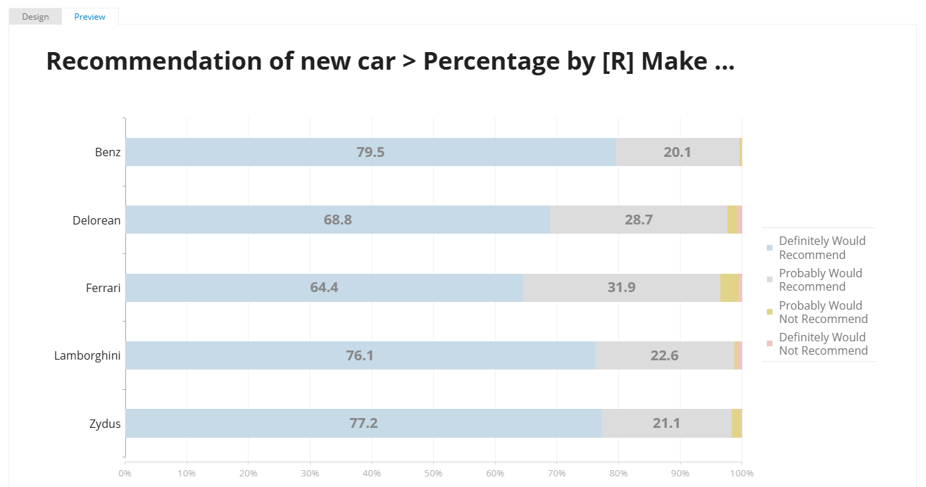
Recommendation Insights with Structure Analysis
For single-response questions like "Recommendation of a New Car" or "Education Level," where responses sum to 100%, Structure Analysis provided clear insights into the recommendation composition of their customer base. Recodes

The market research team frequently needs to transform existing responses into new categories or ranges (e.g., grouping "Age" values into "Young Adults," "Middle-Aged," "Seniors" or reassigning satisfaction scores from 1-5 to "Low," "Medium," "High"). Halo Reports facilitates this through its recoding options. Furthermore, reusable mappings enable the marketing team to apply the same recoding pattern to multiple variables (e.g., "satisfaction with vehicle A" and "satisfaction with vehicle B"), ensuring consistent categorization across brands and streamlining the data preparation process.
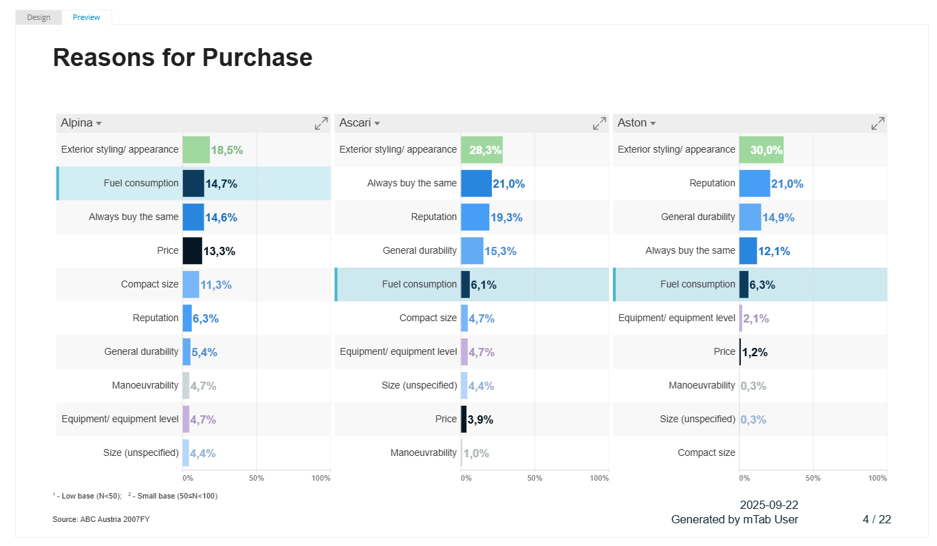
Prevalence of Feedback with Frequency Analysis

For multi-choice questions (e.g., "Reasons for Purchase," "Problems Experienced") where percentages could exceed 100%, Frequency Analysis was crucial. This allowed them to quickly understand the prevalence of various customer feedback points, such as the most frequently cited "good points about a new car," displayed in descending order.
Relationship Visualization with Scatterplots
Scatterplots were particularly useful for visualizing relationships between Key Performance Indicators (KPIs), displaying up to four metrics per bubble (X and Y position, bubble color, and bubble size).

All these visualizations were built effortlessly by dragging and dropping variables into specific panels within the Query section. The system's various statistic types (e.g., mean, median, standard deviation, weighted/unweighted counts, various percentages, and Top-N-Box) ensured they could extract precise metrics for any analysis.
Building Custom Dashboards in Minutes for Deeper Insights
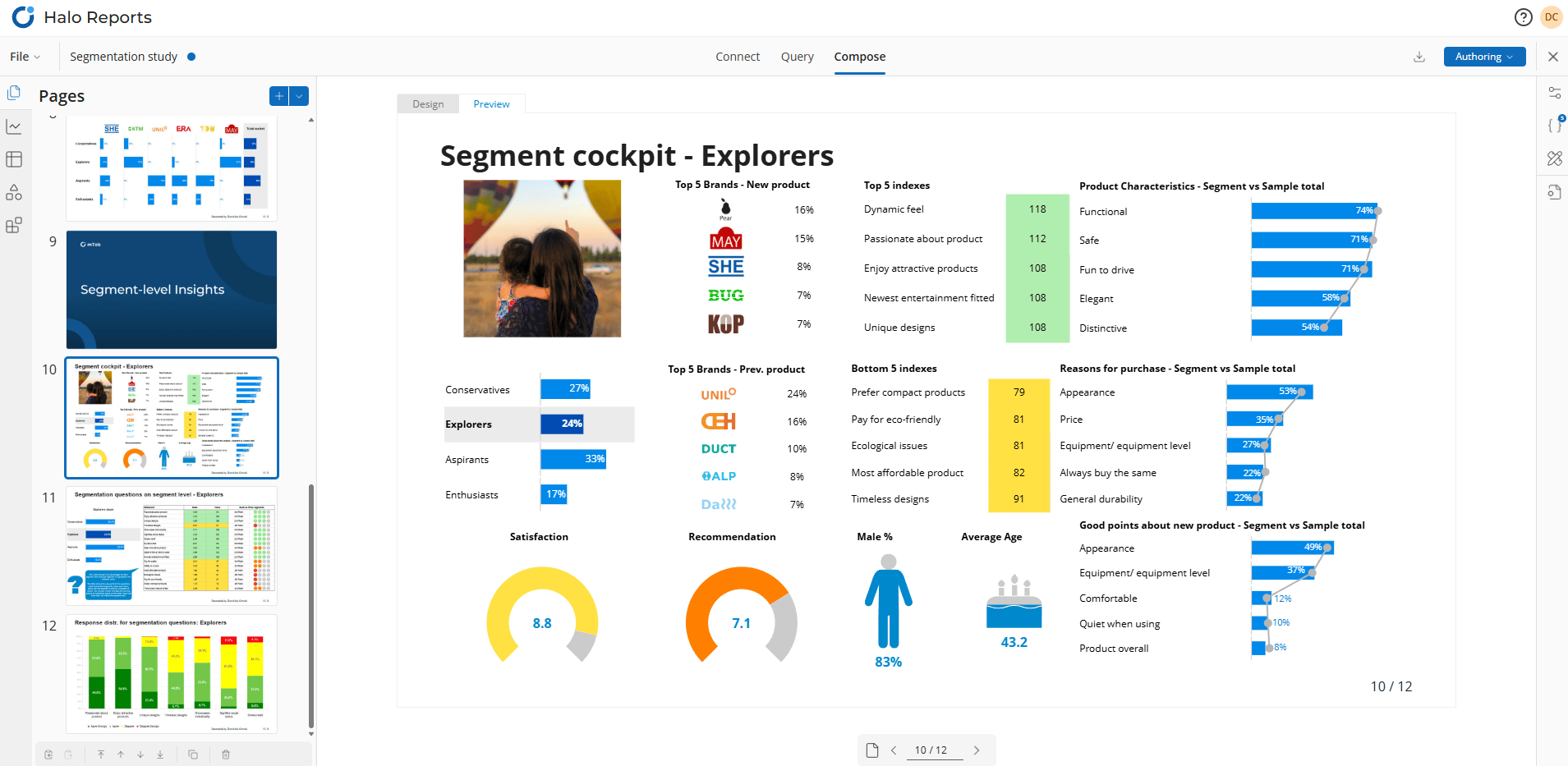
To transform these analyses into actionable, presentation-ready reports, the team utilized the Compose module (Authoring mode). This module enabled rapid design of interactive, custom dashboards.
Analysts could drag desired chart types (including Area Charts, Bar/Line Charts) directly onto their pages. They then linked previously prepared queries to populate the charts with data. The flexibility of Compose even allowed for multiple charts and various linked queries on a single page.
For displaying large, detailed datasets, Grid Widgets were indispensable. These dynamic tables could include data from multiple queries and trended data for comparison, supporting dynamic rows and columns.
Various widgets (Shape, Multi-Shape, Gauge, Dynamic Images) were incorporated to add visually engaging infographics that automatically updated with data changes. Dynamic Images, for instance, displayed different product images based on selected market segments or performance metrics.
Parameters played a crucial role, acting as dynamic filters across the entire report or locally to specific pages or tables. This allowed stakeholders to interactively switch between brands, regions, or time periods without altering underlying queries.
Conditional Formatting was applied to highlight critical values based on data-driven rules (e.g., coloring cells red for underperforming regions).
Expressions in Compose provided powerful capabilities to link page objects dynamically to data from Query, frequently using the TabReference function to retrieve specific values for dashboards.

One-Click, Presentation-Ready Reports
Upon finalizing their dashboards in Compose, the team could easily generate concise, presentation-ready reports for various stakeholders.
For broader internal distribution, the Viewing mode allowed sharing view-only reports. Users could interact with the data by adjusting parameter values or using on-chart interactions, but could not modify the original content or report structure, ensuring consistent information delivery.
If your colleagues have storybuilding capability, then they can create a perfect report from preexisting pages without the need to have authoring license.
Furthermore, applying corporate design standards (Theme) automatically across all pages guaranteed a professional and consistent brand image for all shared reports.
You can present your report online to your colleagues or customers and your report will have all the interactive features available.
Reports could be exported to PowerPoint (.pptx), Excel (.xlsx), or PDF (.pdf), with options to export the entire report or specific pages.
This comprehensive approach empowered the analytics team to not only visualize data effectively but also to create dynamic, insightful, and presentation-ready reports, significantly increasing their value to the organization.